Judging a Book by its Cover
Something magical happens when a file on your computer starts turning into a book. It begins to move from a 2D .doc into something more. For us that happened during the book design phase.
Once we’d finalized the book content edit, it was time to shift creative gears toward the interior and cover design for Wonder Year. Our publisher, Wonderwell, engaged a designer with a keen eye and artistic expertise to assist us with the process, which took a phased approach across several months.
Phase 1 – Interior Design
The first phase was to design the book’s interior. We met our designer, Morgan Krehbiel, and shared background on Wonder Year so she could get a sense of our direction. Morgan then offered a first draft of sample interior pages and included questions for us on preferred page layout, fonts, and colors. She captured our desired look and feel beautifully on the first pass, and few modifications were needed.
We wanted readers to be able to consume our book sequentially or in stand-alone sections, so spatial layout and navigational ease was important. Placement of headers, subheaders, sidebars, and textboxes all make this more manageable for the reader. And fonts convey such a range of moods! We loved several of the first round selections for the body and subheaders. The main title font didn’t feel quite right, as it called attention to itself rather than the text. We played with a few options and landed on an alternate font called that felt understated, clean, and approachable.
We agreed with most of Morgan’s first-round color selections for the book. Of the palette of nine colors, we swapped only two. For one, we ended up choosing something a bit more edgy and outside the norm of our “earthy” color family for a bit of unexpected “pop” threaded through the book. Can you guess which one it was from this set?
Given the nature of Wonder Year, we decided that interior artwork and photos would enhance the reader’s visual experience and help bring the text to life. “Milepost” artwork graphics give one’s eyes a place to rest. Finding the right set of artwork, and then custom-coloring it for our book, took additional design time.
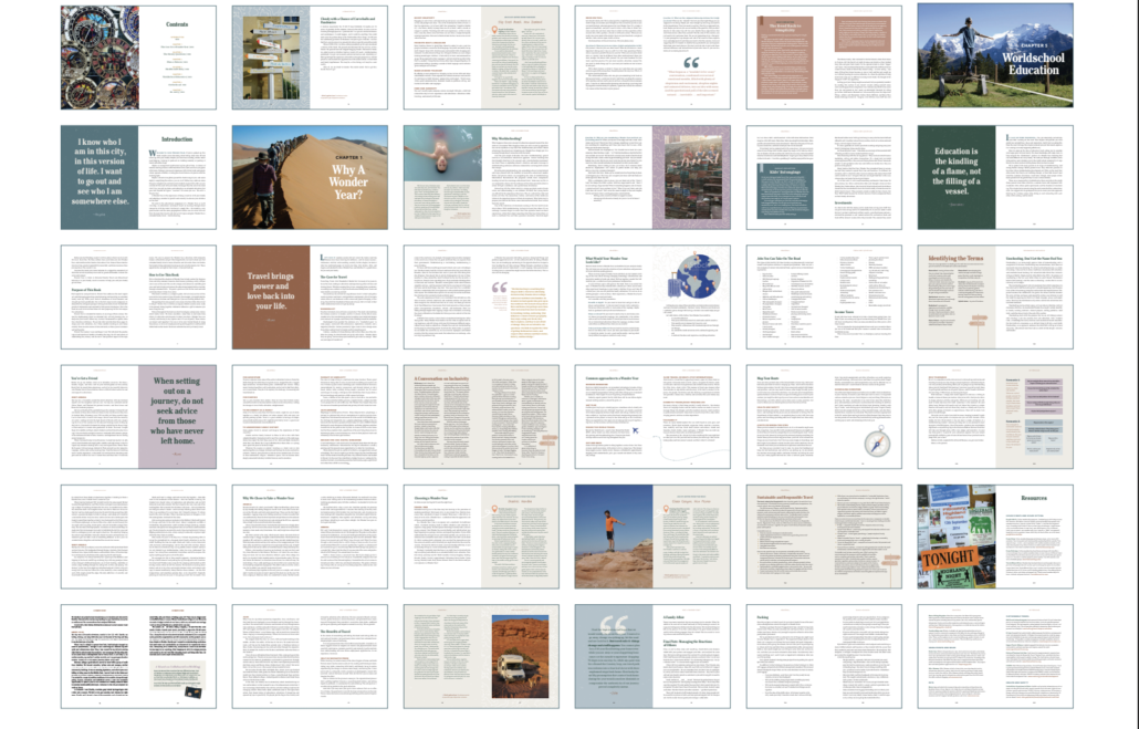
Photo selection and editing was a huge undertaking. We decided to use our own travel photos, as we didn’t want the imagery to look like “stock.” We each had thousands of images, so it took many rounds of review and selections to choose photos that would enhance the story and provide the reader with inspiration of what a Wonder Year can be. We also had to balance families, geographies, activities, and storytelling moments to support the how-to content and travel vignettes. Many snapshots taken by phones could only be used in small insets. We needed full-spread chapter openers to have been taken using our best cameras. After finally locking in our team selections and placement, there was a late curveball from our publisher, who told us to cut one-third of our photos to help reduce the book’s page count! We hope where we ultimately landed feels just right.
Phase 2 – Cover Design Ideation
They say you shouldn’t judge a book by its cover, but then everyone does it anyway. A book’s cover makes a huge difference in whether consumers will even pick it up, much less purchase and read it. Our cover design process started with visual brainstorming, including visiting bookstores to snap photos of other covers that caught our attention. Morgan told us that it was helpful to take notes along the way on what we liked and what we didn’t. Here’s what we shared with her:
- “We’re drawn to single or simpler image vs. collage of many images, hand-drawn art vs. icon style or a computer-generated feel, cover designs that have a sense of movement, imagery that conveys or hints at what the book is about, and titles that are easy to read vs. buried in a lot of other design features
- Our desired vibe is trusted friend, curated, expert, approachable, natural, how-to, and inspirational. We want to capture a sense of wonder, togetherness, and adventure.
- We’re leaning away from using a cover photo, as it’s hard to find a single image that represents the whole worldschooling experience and that is inclusive of many types of travelers. We are also less drawn to collage of multiple images, as they feel busy.
- We don’t want color-blocking design or strong, straight/bold-lined graphics, which seem to be used more for fiction and business books. These designs also compete with the casual, organic feel we’re going for.”
We captured ideas on a Pinterest board – check it out so you can see what inspired us. Based on this feedback and a conversation together, Morgan designed a set of first-round mockups for our review.
Phase 3 – Design Iteration and Selection
The review of initial designs screened for the main messages conveyed. Modern? Travel? Family? Guidebook? Those ideas are woven into the font, layout, imagery, and colors. Synchronicity with the interior art was important, too, so everything would feel cohesive to readers.
We kept two potential designs from round one, requesting some changes so we could consider them further. We eliminated two others that didn’t feel on target. In place of the eliminated options, we asked for a few fresh ideas and offered some additional direction.
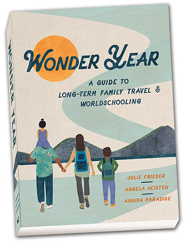
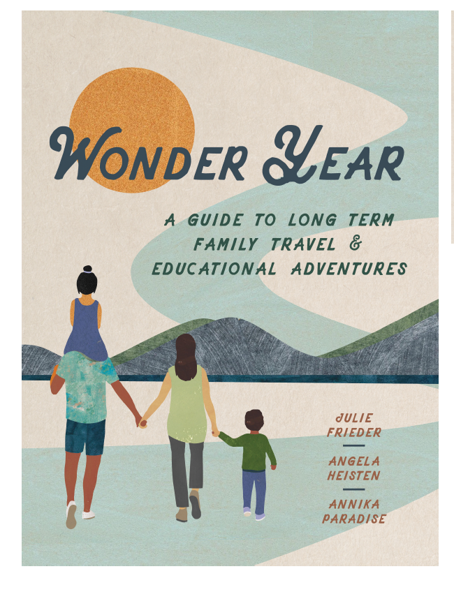
Round two yielded two new designs that became our front-runners. Option A provided an image that clearly conveyed travel and movement and we liked its “scenes” theme, but we wanted it to have a clearer feeling of family. Option B clearly conveyed family travel and caught our attention. Although the vote within our author team was initially split, after a few iterations, Option A was eliminated because it was difficult to see its interesting details from even a short distance. Option B provided everything our cover needed and was our winner!
For quick look at some of our cover options, check out the video reel here.
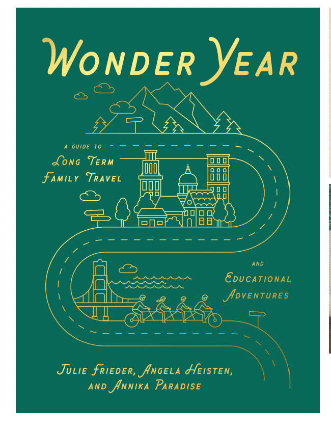
This was a runner-up direction. What do you think?
Phase 4 – Refinement
The cover then underwent a series of changes and feedback rounds on final details. The end result needed to clearly communicate travel, education, and family, and it needed to work for both digital screens and bookstore shelves.
This was really the nitty-gritty: we added backpacks to our family travelers and adjusted their sizes and straps. The family’s clothes were changed, as was the height of one of the kids to convey that a Wonder Year is for all ages. We spent considerable time ensuring the family felt inclusive. Then, what should they be walking on and toward? We also looked at title and subtitle font options, including subtle differences in letter slant to convey a sense of movement. Which word should the subtitle wrap on to make it easy to read? Should we raise the font, or add embossing, foiling, or a textured cover? Where do we put our names? The devil was in these details. We asked Morgan for a lot, and were ultimately thrilled with the refinements when we signed off on the final version.
Almost there. We thought the child on the right was too young, and maybe we wanted to add backpacks. Oh, and we changed the title in the 7th hour.
Phase 5 – Full Cover Development
Once the front cover design was locked in, we turned our attention to the full wrap, including the back cover and cover flaps. This included the book summary (so important for catching readers’ attention in 30 seconds or less), credits, social media contacts, and selection and placement of endorsements. Finally, we added our abbreviated author bios and photos, which made it all feel really, really, real!
As you can see, A LOT goes into the book design process.
So…here’s our final cover. Looking back at the early list for our designer, how did we do??